Archive for Webcomic

Journey, by Caroline Parkinson

Posted in Review with tags , , , , on February 6, 2010 by comicmole

This review was originally written for REDEYE magazine.

‘Journey’ by Caroline Parkinson, 9 pages, A5 full colour stapled single issue, £2.50.


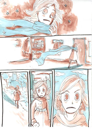
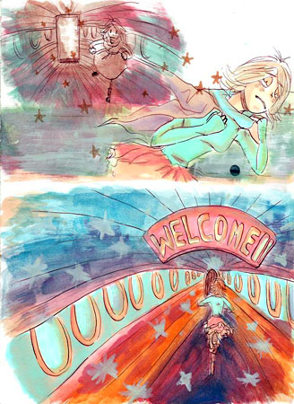
Journey is a one-shot single issue wordless comic that tells the story of a relationship as it begins, blossoms, and matures, all under the watchful gaze of an underground station’s security camera.

The comic tells a subdued story with little action or passionate romance, however the reader’s attention is held by Caroline Parkinson’s attention to detail in the layout of her pages.  A feast of different angles are utilised in the panels: wide-angle establishing shots, close-ups, overhead shots from the security camera’s perspective, and even top-down views where appropriate.  The cover showcases this style: it features a crowd of people at an underground station, all drawn from a demanding overhead perspective.

Most of the art is drawn very accurately, however proportion is sometimes a little off in close-up shots of the characters. The colour palette is quite bright and the colours have reproduced very well in print, giving a light and airy feel.

I can’t say too much about the story here as it would be too easy to spoil 9 pages worth, but the characters are easy to relate to, and lets just say that the course of love as told here doesn’t necessarily run smoothly.

To some readers, Journey will be a worthwhile read that leaves them pondering over their own experiences in love.  However, the somewhat experimental art might leave others feeling that it is a little dry: rather like it was an extended drawing exercise for the creator.

Personally I would like to have seen the concept of a relationship as seen through the eyes of a security camera pushed a little further than it was in Journey.  For example, I wonder what Caroline could have come up with if she had restricted herself to only using shots taken through the ‘eyes’ of a network of security cameras, and perhaps with a more muted colour palette to reflect the dull, fluorescent light of underground stations.  But I have to commend Caroline on basing her comic on normal people.  Her characters don’t have any special abilities, they’re not from some crazy parallel universe, and they’re not suffering from any out-of-the-ordinary angst.  They are believable everyday people: anyone you might see whilst waiting for the underground, or even yourself.

I would recommend this thought-provoking short comic to those who enjoy stories that are predominantly told through quiet pictures, rather than lots of text and effects.  This is one to absorb over a calming tea break.

Journey can be read for free on Caroline’s website http://carolineparkinson.co.uk/ (just go to the ‘comics’ section and scroll down until you see a thumbnail for it – click on the numbers to read each page in order).  More of her work, and contact details, can also be found there.

A review copy of this comic was provided.

‘Between Worlds’ Part 1, by Anna Fitzpatrick

Posted in Review with tags , , , , on January 14, 2010 by comicmole

Between Worlds Part 1 by Anna Fitzpatrick, 56 pages, A5 perfect bound booklet, IndieManga, £4.00, rated teen 13+

First-off, this review focuses on the black and white print version of Part 1 of Between Worlds (as detailed above), but there are other ways to read this comic too.   There is a full-colour, larger format, special limited edition printing of Part 1 available from IndieManga for £15.00, or if you can’t wait to glue your eyeballs to both this Part and the beginning of Part 2 then check out the full colour webcomic version of Between Worlds on DrunkDuck (you can also leave comments for the author there on a page-by-page basis if you want to).

It is cold on the night of the aging King Bergen’s birthday, and a light snow has started to fall.  A grand speech has been planned, but as the King prepares to give it he is taken ill.  It seems that one of his four Knights, the female soldier known as Lynx, is tormenting him in his dreams.  Lynx herself however is confused.  Is the King simply suffering paranoia brought on by old age, or is something more sinister afoot?

Immediately upon starting this comic I felt pulled into its world.   I could almost see my breath in the chilly air and watch the snow float by.  There was also a creeping sense of melancholy brought about by witnessing the aftermath of the old King’s fall from virile youth to confused old age, and perhaps his nation with him.

Within this nation resides the protagonist, the Knight Lynx.  She is somewhat reminiscent of Oscar from Rose of Versailles:  a female soldier who holds a high rank and seems to be successful, but comes across as an isolated figure who doesn’t completely understand those around her, and whom no-one can become particularly close to.  She is an intriguing character, obviously very capable but perhaps harbouring a hidden weakness or pain.

We don’t get to learn an awful lot about her though as, although Part 1 is long compared to a lot of small press comics, it very much reads like a prelude to the main plot of the series.  The pace of reading is also relatively slow, so over the story’s 36 pages plot events only begin to unfold.  This is not a criticism however, as like many readers I appreciate an author giving their story the time it needs to unfold at a pace that suits it.  Just like the period manga series ‘Emma’ by Kaoru Mori, I can see a lot of readers enjoying the attention to detail and inclusion of quiet moments here.  The only thing that worries me is that the story seems like it could be quite long, so I hope that the creator keeps producing material and that ‘real life’ doesn’t get in the way, like it can do with longer side projects.   Here’s a reason why, so we can see more artwork like this:

This page is from the webcomic version, but in case anyone is worried that the painted pages might turn out muddy in black and white they actually hold up very well.  I can’t get a good scan of my copy of the comic without ruining the binding, but I’ve mocked up a quick example of colour vs. black and white with some astounding Photoshop wizardry:

As you can see, the tones on the page are well balanced for retaining their impact in black and white, and the book is balanced nicely like this throughout.

After those examples I’m not sure if there’s anything else I really need to say about the artwork.  As you can see the comic is digitally painted in full colour for the webcomic and special edition versions, and desaturated to greyscale for the black and white edition.  The painting style has an organic feel, with important elements being picked out in either very dark or very light linework where appropriate to the background colour.  Highlights such as snowflakes or points of light add an ethereal and fantastical feel to the world.  Some pages of the comic seem like they had more care taken over them than others however, with some devolving into a sketchiness that is perhaps a little too uncontrolled to hold up to the rest of the book.

On the right above is the A5 black and white edition of Between Worlds Part 1, next to the larger special edition version.  Both books are very well presented.  The black and white version has full colour covers and is trimmed and perfect bound into a neat booklet, rather than stapled.  All of the text in the comic is clear and easy to read, tho perhaps a little large in the special edition version.  Digitally produced text bubbles stand out rather a lot from the more natural feel of the painted pages behind them, but personally I would rather be able to read a comic clearly than be bogged down by less readable hand-written text.  Colouring the text bubbles slightly in the colour versions of the comic is a nice touch that helps to integrate them with the look of the page behind.  Perhaps hand-drawing the speech bubbles themselves though might have helped to link them to the page a bit more successfully.

As well as 36 pages of story, both the normal and special edition books of Part 1 include several pages of interesting extras.  All in all the books each have 56 pages, of which 12 are extras.   These include many concept sketches and a two-page mini comic called ‘Juno’s First Day’.

Between Worlds Part 1 is the beginning of a story with a lot of promise.  A feeling of melancholy and uncertainty in the nation of the old King Bergen is reflected in the introduction of the isolated protagonist, the Knight Lynx.  And apart from a few rather rushed looking pages, the organic, otherworldy style of illustration makes this a comic to seek out and enjoy.

The best way to immediately read some Between Worlds is by visiting the webcomic.  And to see more of Anna’s artwork, why not visit her website, or art blog?

A review copy of this comic was provided by the publisher.

New Comic: Dragon Heir Reborn

Posted in New Comic with tags , , , , on October 19, 2009 by comicmole

DH_rebornImages

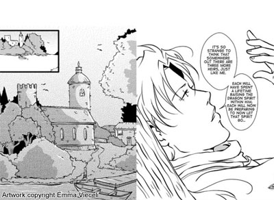
Hot on the heels of her announcement in our recent interview, Emma Vieceli has unveiled the first five pages of her new series ‘Dragon Heir: Reborn’ as a webcomic.  Its free to read so go check it outHer blog post about it provides some more info, and would-be commenters are directed there too.  Happy reading!

FanDanGo Rebooted!

Posted in New Comic with tags , , , , , on October 4, 2009 by comicmole

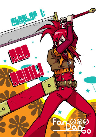
Remember way back when I wrote a column about Kate Holden’s webcomic, FanDanGo? Well after a hiatus the comic is back!  Its being entirely rebooted from scratch as Fan Dan Go (note the spaces), making use of Kate’s signature super colourful 70s stylings right from the start.

fandango1

Regular updates are scheduled for Wednesdays and Sundays, and there have even been mutterings about a black-and-white print version in the future, for you types who prefer to read comics on actual sheets of paper ^_~

Kate has stated that she is leaving the old version of the comic up online for posterity, so its interesting to go back and see how all this began – but more importantly, here’s to more Fan Dan Go in the future!

New Comic: Aya.Takeo, by Lloyd Prentice and Sonia Leong

Posted in New Comic with tags , , , , , , , , on May 4, 2009 by comicmole

ayatakeocover

Debuting at the May MCM London Expo this year is a new print volume of the free webcomic Aya.Takeo by Lloyd Prentice with art by Sonia Leong.  The volume collects the first year of the webcomic and, quite uniquely for a small press book, is presented in full colour.  It will be available to buy online from Sweatdrop Studios’ online shop shortly after the event, so it should still be easy to get hold of if you’re not planning to attend ^_^

Mole side note: as you can probably tell from the scarcity of posts lately I haven’t had an awful lot of time for writing comic reviews in the last month, but I’m hoping to be able to get back on track with more solid updates soon so please bear with me.

New Comic: More comics by Rachel Saunders available to read online

Posted in New Comic with tags , , , on May 4, 2009 by comicmole

Rachel Saunders, the artist who drew First Law, has a new home on the web for her comics at Ciao Gatto, her online portfolio. At the moment there are some intriguing hints as to what she has planned for 2009, but unfortunately very few preview images or links to webcomics.  One comic you can link to from Ciao Gatto though is her 2007-08 Tokyopop Rising Stars of Manga entry ‘Parasites’ which got through to the final of the competition that year.

parasitesexample

As you can see from this page, the art is top-notch and its well worth checking out if you enjoyed First Law.  Also of note on Ciao Gatto is Rachel’s gallery, where you can see some examples of her standalone work.

One last thing to note: if you are planning on attending the upcoming May MCM London Expo, look out for a new print comic from Rachel called ‘A Night with a Wolf’.

Far-Out-Mantic by Sarah Burgess

Posted in New Comic, Review with tags , , , , , , on March 27, 2009 by comicmole

f-o-m_2

Far-Out-Mantic is a unique full-colour webcomic by Sarah Burgess.  It can be read on her SmackJeeves account and at the time of writing this post it has pages numbering into the mid-60s and continues to be regularly updated.

Recently, Sarah has also self-published a printed ‘Book 1’ of the comic which will debut at this weekend’s London Web and Mini Comics Thing (28-29th March 2009), so look out for it if you’re going to be there! She doesn’t have an online shop but if you would like a copy to be posted to you (with payment probably via cheque), you can contact her on her email address which is on her profile page at SmackJeeves.

(As with Sammy Borras’ comic ‘Late’, which I covered in my last post, do go and support Sarah via the comment system on SmackJeeves if you like her work.  You don’t have to be a member of the website to comment so there’s none of that annoying account-setup business to deal with.)

So onto the subject at hand! The comic begins with Penelope, a somewhat scatterbrained young woman who is not so lucky in love, but has an utter adoration for a certain hip hop band: Far-Out-Mantic.  After she is jilted by the rascal Billy, she bumps into a mysterious book-reading stranger, who later turns up again in her life at the space-wear-only 24-hour disco called Meteor Flo, where the band Far-Out-Mantic are playing to a packed house.

f-o-m_1

The comic can get pretty fantastical at times but the overall pacing fits into the ‘slice-of-life’ genre quite well.  We follow Penelope for the first two chapters, but switch our focus in chapter three to different characters.  Rather than being told about events with narration or overly verbose pages, we are taken along for the ride and shown what is going on, as if we were standing nearby peeking in.

The setting of Far-Out-Mantic is a wonderful slightly off-kilter version of the real world, one where 24-hour space themed discos exist, but above this its the characters that really bring this piece to life.  Penelope herself is a girl-next-door with a shot of determination and a heart full of dreams.  Book-man is a mysterious stranger with a quiff and some good advice.  Characters you meet later include some air hostess lookalikes, some evil musicians and an utterly charming man who sports a green afro with yellow stars in it.

These off-the-wall designs might sound a bit throwaway to some, however each character has his or her own unique personality and these are well-realised through their individual facial expressions and body language.  A loose and sketchy style drawing style, coupled with delicate washes of watercolour, complements this expressiveness.  Each chapter of Far-Out-Mantic has a different predominant colour which has been chosen to fit the mood (trivia: the creator says in her comments that this was inspired by Chloe Citrine’s webcomic ‘Rainbow Carousel‘, which also changes colours with each chapter).

A reason for the creator’s emphasis on expression and flow over tightly inked figures and ruler-straight panel boundaries can be found in her comments printed in ‘ The Mammoth Book of Best New Manga’ Vol. 3 (in which she has an 6-page short entitled ‘Purikura’).  Sarah states that when she draws, she wants to ‘…back away from the obsession with symmetry, accuracy of bodies and form…’ that she prefers ‘…to give a natural life, movement and expression to my characters…I always try to make my comics flow rather than look stiff, wishing to put my heart and tears into every stroke’

f-o-m_3

So, whereas a lot of comic artists begin by focusing on perfecting drawing human bodies and environments very realistically, Sarah has chosen to explore how to bring her characters and their feelings immediately to her audience via the flow of their emotions.  The strengths of an approach like this are that none of Sarah’s art becomes wooden or overdrawn; everything flows very well.  Sometimes characters and backgrounds even verge on the abstract, as although characters’ bodies may not always be proportionally correct, the artist may use this to her advantage to improve the pacing of a page (for an example of what I mean, take a look at the singer on the right hand side of page 29).

Fortunately the comic does not break down into complete abstraction and is easy to read throughout.  Although pages may look quickly drawn, the panel layouts throughout the comic are well considered: little explanation is required for readers to know what is going on other than simply by following the flow of images.

For these reasons I can imagine how some readers will fall in love with this comic’s art.  However, others may find that the drawing style is not accurate or considered enough for them to enjoy it completely.  Personally I feel that some of the art could benefit from a little more accuracy, however too much tightening would ruin the delicate hand-drawn feel of the comic.  For example, the vertical lines in the backgrounds sometimes trail off diagonally, but rather than stamp ruled lines all over it, if the artist could just keep in mind that all of these lines should normally be parallel to the edge of the paper, it shouldn’t affect the flow of the piece but would help the solidity of the backgrounds.

Art style aside, probably the most interesting thing about Far-Out-Mantic is the wide range of influences that have inspired Sarah to draw it: music, fashion from the 1950s, 60s and 70s, and of course the retro futuristic sci-fi trend which also spanned those decades.  She talks about her influences in the comments that she writes on some of the pages, making them an interesting read.  Perhaps the overarching inspiration for the comic though is the album ExpoExpo by the Japanese hip hop band M Flo, so I will leave you with one of the links Sarah posted in her comments, to a YouTube video of the song ‘Prism’, which captures a lot of the fun space-pop feel of the comic – enjoy!

New Comic: Ambient Rhythm volume 1 by Morag Lewis

Posted in New Comic with tags , , , , , , , on March 13, 2009 by comicmole

arhythm-poster

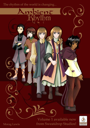
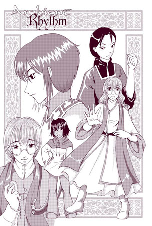
Ambient Rhythm volume 1 is going to be launched at Minamicon 2009 (27th-29th March).  This volume collects pages from the first year and half of the webcomic,  and its written and drawn by a comicker you may have heard of if you’ve been keeping up with recent Mole posts – Morag Lewis!

If you just can’t wait to read it, the webcomic is still updating on toothycat.net each week as well.

ambrythphoto

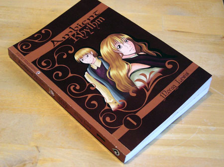
My copy is already starting to look a bit read, as well it should because I just finished reading it this morning. I had been keeping up with the weekly webcomic updates already but I found that reading the story as a printed book rather than on-screen suited this comic very well: the subject matter of characters searching for answers around old university buildings and libraries just works nicely on paper, plus I was able to flick back easily to see if I had missed any clues, or to check someone’s name.

I won’t say anything more about what happens in this comic apart from that, personally, this one is turning out to be my favourite Morag Lewis work (after Artifaxis), so I recommend taking a look at it.  The rest I will leave to a proper review post, hopefully not too far in the future ^_^

An Interview with Morag Lewis

Posted in Interview with tags , , , , , , , on March 5, 2009 by comicmole

Mole notes –

Previous posts about Morag’s work: An Introduction to Reya, Artifaxis review

This interview was done in late 2008, so the Ambient Rhythm volume one that Morag mentions is actually due out in spring this year (2009), not next year.

moraglewis

Comic Mole:  At the moment you are busy producing the comic ‘Reya’, which has been picked up by Markosia – can you tell us a little about Reya and how you came up with the idea for the comic?

Morag Lewis:  Reya was originally conceived as a short story, but it clearly had more going on than what was said – it didn’t really fit into such a short space. My husband wrote the original (which will be included in the graphic novel), and when I asked him about making a graphic novel out of the short story, he responded with a complete synopsis, which I hadn’t been expecting! He says he wanted to write about a magical girl, but to be different – and it would be different if the magical girl had no magic.

CM:  As well as Reya you have in fact been comicking for several years now, producing several pages a week – how do you fit creating comics into your life around a full-time job and other everyday commitments?

ML:  If you want to do something badly enough, you will find the time. I often fit bits of comic creation in where I can – I can compile pages on the bus, and I sometimes tone while watching anime. Inking, drawing and scripting, of course, have more attention devoted to them, although I do regularly ink at the pub during Saturday lunch ^^

CM:  Can you recall what first made you want to start a webcomic?

ML:  I can’t, actually. I know I read Megatokyo and thought, if he can do it, so can I, but I don’t know why I wanted to do one in the first place. It sounded like fun, I suppose (!)

CM:  Which artists or styles inspire you the most?

ML:  Lovely delicate ink work. I very much like the art in Quiet Country Cafe, a beautiful manga which as yet has no English translation. I have a lot of the Japanese tankoubons, and the artist, Ashinano Hitoshi, does a fantastic job of portraying landscapes purely in ink. I like the contrast of pure black and white, so CLAMP’s more recent works, such as XXXholic, are also very attractive. That said, I tend to be actually inspired more by stories than by artwork – really good books are very inspiring.

CM:  Having created several comics in different formats, have you experimented with many different mediums for the artwork?  Do you have any particular favourite tools or media for producing comics?

ML:  I’ve tried pencil, ink alone, ink and colour alcohol markers, and ink-and-tone. I prefer ink alone, because I think I produce better linework that way, but a little tone can be very effective as well. I found colouring using markers time-consuming and expensive, but I do like having colour in a comic. I suppose Reya has the ideal setup – I get to do the inking and then Natalie produces the awesome colour work ^^
ambientrhythm

CM:  As well as writing the stories for multi-chapter comics such as ‘Reya’ and ‘Looking for the Sun’, you also have experience writing short comics and even short prose stories – is there any type of writing you prefer?  And do you feel that there are any specific requirements in writing for webcomic format especially?

ML:  I prefer long comics, because I find comics easier to create than novels, and because I like having the time to get to know the characters properly. That said, short stories, whether prose or comics, are really good fun and very satisfying in a short term kind of way.

For webcomics, yes, I think so (although obviously, it’s up to the creator what they’re making the comic for, so it’s their call). Webcomic format is typically a single page update once or more per week, and readers to expect a payoff for each update, whether that’s a joke or a plot point (preferably both). It can be very difficult to balance that with making something printable if you don’t do gag strips. I love gag strips, but I don’t have that sort of sense of humour, so my stories have to be principally plot-based, which means I have to craft the plot development round the updates. That’s not so bad if your comic is solely a webcomic, like my first one, but if you are writing something destined for print as well, you have to make sure it works both as a webcomic – which requires short, standalone, punchy strips – and as a graphic novel, which requires an ongoing story arc. On the other hand, updating several pages or an entire chapter at a time, like Reya has done, avoids both those problems, so as long as your readers are willing to wait for a month or so for the next twenty page chunk, that works out well.

CM:  You have work available both online and in print – what are your thoughts on the differences between the two presentation methods, and do you consider one to be any better than the other?

ML:  In terms of getting readers, webcomics are better because they are free. I also like the way that they force you to a schedule, and the constant creating also encourages rapid improvement. On the other hand, there’s a lot of dross on the internet and the effort involved in creating a printed comic means that relatively few people do it, so a printed comic stands out more. I love the feel of holding an actual, printed book in my hands as well – it’s very satisfying. And I prefer reading paper books. So they both have advantages. I like to do both, to get every advantage I can 😉

CM:  What has been your favourite comic to work on so far, and why?

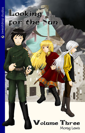
ML:  I shouldn’t have favourites, but it would have to be Looking for the Sun, because it ran for so long – I got very involved with the characters and the story, and I still miss them. On the other hand, I’m really enjoying doing Ambient Rhythm and Reya right now, because they both started recently and I think the artwork is much better!
lookingforthesun3

CM:  Do you have any favourite characters from your own work?  If so, what do you enjoy about them?

ML:  Again, I shouldn’t – but I do. Kite and Saryth, from Looking for the Sun, because they orchestrated their own development without me even noticing. They are sufficiently well-rounded that their growth led naturally from what happened to them, and I really enjoyed writing the stories for them. But I do like pretty much every character I’ve written – they’ve all got something special to them. Quite apart from her character, Reya is very cute, and I just like drawing her.

CM:  Do you have any plans for the future that you can tell us about?

ML:  Finishing Reya is the first one, definitely. I’m really enjoying working on it and I can’t wait to get the graphic novel finished. I’m also expecting to be able to publish the first graphic novel of Ambient Rhythm, my webcomic, next year. And there are other things, as yet unformed, which I think about a lot when I’m bored 😉

CM:  What is your favourite dessert?

ML:  Ooh. That’s hard. Erm… probably the pecan cake I make from a Canadian recipe (in Canada they call it broiler cake, but we don’t have a broiler). Or maybe flapjacks. Or the sakura mochi that Teri Aki serves. I like meringues, crunchy on the outside and chewy on the inside. Right now. I’m enjoying pineapple tarts too – there are way too many good desserts and just not enough time ^^

…and with all that talk of pudding, the Mole’s off to raid the fridge!

An Introduction to Reya

Posted in Column with tags , , , , , , , , on March 4, 2009 by comicmole

Very soon I will be posting up an interview with Morag Lewis, the creator of several web and print comics including the completed series ‘Looking for the Sun’ and the ongoing webcomic ‘Ambient Rhythm’, both published by Sweatdrop Studios (check Morag’s own website toothycat.net to read most of her comics for free online, or the Sweatdrop Studios shop to buy print editions).

In our interview we focused on her soon-to-be-released comic, ‘Reya’, published by Markosia, as well as talking about many all-important comics topics (like desserts ^_~ ).   ‘Reya’ is a comic which debuted in 2008 – Chapter One is available to read for free on Myebook and the entire comic should be available to read for free online and as a print edition soon (I’ll post an update when the full comic is released).  The writing, penciling and inks are all done by Morag and the colour work on the first few pages is by Natalie Roberts.

reyacover

The comic is named after its lead character, the young girl Reya, who has just moved from her home village to a new town to study magic.  She is a little confused however because, as far as she knows, she has no magic within her and therefore cannot study it properly.

Neither can I, unfortunately, tell you much more of the plot, as with only one chapter to read there’s not an awful lot that can be said at this stage.  However, if you’re hungry for some more Reya straight away, you might be happy to know that this is not the first time we have been graced with her presence: she was originally part of a short story that was submitted to a past Tokyopop ‘Rising Stars of Manga’ competition.  Unfortunately she didn’t win, but her tale can be found in Sweatdrop Studios’ ‘Stardust’ anthology, which I reviewed in a previous blog entry.

Like her previous incarnation, the general feel of the comic ‘Reya’ is all-ages friendly.  Morag has mentioned that the story will get darker as it progresses, but she hopes that it will remain accessible and enjoyable to as wide an audience as possible.  The art style’ will be familiar to anyone to has read the author’s other work – it very much has her signature look to it.  The colour pages by Natalie Roberts are a treat for online readers but it can be assumed that, because of high printing prices for full colour works, the printed edition will probably be black and white only.  I recommend checking out the colour pages online even if you are planning to buy the print edition as they are very well executed, as you can see:

reyapage1

Thus ends my introduction to ‘Reya’ – as said previously I will upload the interview with Morag ASAP, and keep your eyes peeled for a future announcement of the release of the full edition!