King of a Miniature Garden: Chapters 1 & 2, by Chi-tan

Posted in Review with tags , , , on March 28, 2010 by comicmole

This review was originally written for REDEYE magazine.

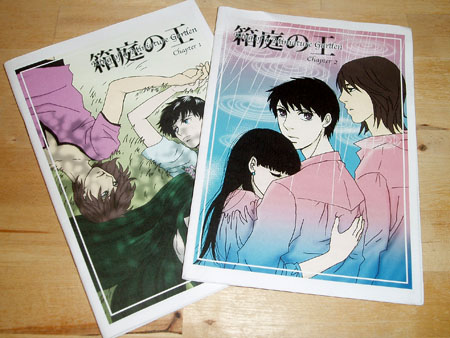
Published by Umisen-Yamasen, Chapter 1 is 24 pages, Chapter 2 is 18 pages, A5 stapled floppies with colour-printed paper covers, no price given.

A young man named Hiragi lives trapped in a mansion on an island.  He had been in a car crash that left him with injuries affecting his memory, and his parents sent him to the mansion to recuperate.  He can only interact with the six other people that reside on the island, but he’s not lonely.  His caretaker, another young man by the name of Takuro, has become the centre of his life.  However, his tranquil existence is turned upside-down one day when everyone but Takuro leaves the island in order to prepare for…THAT.

If you hadn’t guessed from the description already, this is a comic with its roots firmly in the Japanese BL/yaoi genre.  BL stands for ‘boy’s love’: romance stories between two teenage boys or men.  Yaoi takes this a little further, and in the west we tend to associate the term ‘yaoi’ with explicit content.  However the boundaries between terms aren’t particularly strong: you can get some comics labelled as BL that go a little further than you would expect, and some labelled as ‘yaoi’ that end with a simple kiss and holding of hands.  This particular comic does venture into some adult territory, but does not actually include any explicit content.

Over the course of these two chapters of King of a Miniature Garden, we are introduced to the setup for the rest of the series.  Chapter one tells us about the straightforward world that our two main characters inhabit, and chapter two introduces a third character who may well put a spanner in the works for them.  As an introduction these comics are enjoyable enough, but I would recommend (if possible) getting hold of chapter 3 as well, as that is where I think the story proper will really start (though, having checked on Umisen-Yamasen’s website, I have no idea whether a third chapter was even finished).

The art over both of these chapters wears its Japanese BL influences on its sleeve, but that suits the story, and the artist’s own style does show through her influences.  Characters’ faces have had the most attention paid to them, so they are quite detailed and emotive.  Character bodies, though not always perfectly in proportion, also show some attention to detail.  Backgrounds on the other hand can sometimes be very sketchy, or the artist will resort to large areas of screentone, which doesn’t really suit the more detailed character work.

The lettering for King of a Miniature Garden is a little odd.  The comic is interesting in that it is bilingual: text is written in both Japanese and English.  However a clunky-looking serif font is used for the English text throughout, and the writing style also does not flow incredibly well, for example on page six of chapter one “When tomorrow comes, there’re only I and him”.  Things like this could have been fixed with some proofreading.

Readers who are already boy’s love fans, or who are interested in the genre and also enjoy small press comics, will probably want to pick this one up as its one of the only examples of BL that I’ve seen come out of the UK small press (you can also practice your Japanese!).  However, the clunky text and sometimes-rushed looking art will probably mean that those who have no particular interest in BL won’t find much else for them here.

Review copies of these comics were provided.

‘Legends’, an anthology by IndieManga

Posted in Review with tags , , , , , , , , , , , on March 7, 2010 by comicmole

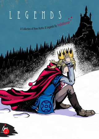
‘Legends’ by IndieManga, 130 pages, A5, black and white with colour covers, £6

“What discerning eyes have you,

to notice here our humble book,

now there’s just one thing to do,

open it and have a look!” – Legends

And thus begins my adventure into Legends, the newest anthology from the comic circle IndieManga.  This book contains five short comics revolving around the central theme of exploring fantastical tales, and in some cases their ties to the real world.

Every member of IndieManga is featured here: Kate Holden, who was one of the winners of this year’s Manga Jiman competition, Anna Fitzpatrick, who writes and draws Between Worlds, Sally Jane Thompson, who created Little Thoughts, Rebecca McCarthy, who’s writing also appeared in IndieManga’s first anthology ‘Origins’, and this time they introduce a new member in the form of Sarah Burgess, who also writes and draws the webcomic Far-Out-Mantic.

Below I’m going to give an example of a page from each comic in the anthology to show their different art styles, and also say a little about what I took away from the story in each short as well.  First up is the 23-page Lucky, by Sarah Burgess:

Lucky is about a lowly squire who loses his pride and joy – his silver-haired horse – to some otherworldly thieves.

The story overall is well-paced, carrying the reader through the fantastical events with ease.  The ending could possibly have used an extra page, just to slow it down and give it more impact, though it closes out with an interesting resonance to the real world.  Similarly to her webcomic, Far-Out-Mantic, Sarah’s art for Lucky has a sketchy, emotions-first-accuracy-second, kind of feel to it.  This means elements like her characters’ expressions and the organic flow of a lot of the pages, are practically perfect.  However, some parts come across as rushed or even just anatomically wrong, which jerks the reader out of the story a little.

But what will bring you back in though is the hand-written text.  Hand-drawn speech bubbles settle comfortably into the layout of each page, and parts where the text breaks free and takes your eyes all around the page as you read are really quite special.

Sharing Lucky’s page count of 23 is the next comic – Vitality, written by Rebecca McCarthy and drawn by Anna Fitzpatrick:

Apothecary shop assistant Bryther had been drinking a vitality elixir to keep herself going thorugh a day’s work, but when the shop gets demolished one day she gets a lesson in how much of a good thing might be too much.

Unfortunately I didn’t quite ‘get’ this story.  It felt very much like it was trying to say something, but I’m still not entirely sure what that thing was.  The plot begins in quite a slice-of-life way, focusing on the main character and her shop, but then introduces a lot of characters and big world events in quick succession.  The reader does not really have enough time to digest all of this information before being taken back to a focus on the main character again for the ending.  It seems like this story either needed to be much longer, with time given to introduce world events and the significance of these characters within them, or more stripped-down and simplified to fit into a shorter page count.

Art-wise, this comic has a painterly feel brought about by a use of flowing organic shapes to portray real human anatomy, rather than reducing the forms down to a more graphical style.  Backgrounds are present and correct, and range from a riot of sketchy detail that can be hard to follow, to some wonderfully balanced and atmospheric scenes.  It seems like some of the pages were a labour of love for the artist, and some were more rushed through.   As a lover of small press endevours, I feel that the atmosphere brought out by the tighter, more considered, pages in Vitality makes this comic worth reading.  However a more mainstream audience would probably expect the entire comic to be presented at this standard.

The impact of popular fantasy stories is considered in the next comic from the Legends anthology: A Walk – or a contemplation on fairy tales, viewpoints, creativity and growing up, by Sally Jane Thompson:

A Walk is 11 pages long.  The story follows a young girl, who at the beginning is being read to before bed.  As she hears the tale being read to her, a beanstalk begins to grow out of the book, and take her on a journey where she encounters lots of the stories and artistic styles that inspire her as she grows up.

These inspirations range from simple fairy tales to sparkly romance, into realism, and even some tinges of menace.  As she interacts with each scene the girl visibly grows up, and at the end of the comic she clicks the lid back onto her pen as an adult artist.

This comic is obviously a very personal one that portrays several stories that have been inspirations or influences on the creator’s own development as an author and artist, perhaps also as a person.

Many different artistic styles and drawing media are used throughout this comic.  The girl herself is always drawn with Sally’s trademark brushpen strokes, which both links her character to Sally as a person and brings all of the disparate art styles used in the comic together as one piece.  As she takes her walk we pass panels drawn in a shojo (girl’s) manga style, simplified cartoons, patterns inspired by art nouveau, use of natural media, ink and screentones.  Its a completely wordless comic, but you won’t miss the words at all.

Also making quite a sparing use of text is the next Legends entry: the 15 page 5 Finger Discount, by Anna Fitzpatrick:

In 5 Finger Discount, when a girl tries to steal a transformation potion from an old witch, an amazing transformations occurs…that could get her into a lot of trouble.

Stand out characters here are the old witch and the horrible blob monster you can see on the page above.  They’re gloriously grotesque!  The entire comic is of course drawn in Anna’s signature painterly style, but compared to Vitality, which she also drew, the screentones used here are of a larger scale (meaning that the dots are larger and further apart than the screentones used for Vitality).  This means that some of the forms of the characters and backgrounds are a little bit less solid and more confusing to the eye, but it also gives the comic a lighter, more airy feel than Vitality, and thus its own personality.

The digital text used for the lettering in 5 Finger Discount is certainly very readable (which should be the first priority), but its also a little jarring over such natural-feeling artwork as Anna’s.  On the other hand, the hand-written sound effects used here (such as the ‘wugableeugh!’ in the page above) are a real high point of the comic – perfectly legible throughout, balanced very nicely with the artwork on each page that they are used on, and suiting the unique personality of the story extremely well.

Showing yet another side to the personality of IndieManga as a group is the final entry in the Legends anthology, the 17 page Adventure, by Kate Holden:

At a foreboding castle in the desolate mountains, a group of three adventures goes toe-to-toe with an ancient foe and his army of automaton minions.

…did I mention the foe had epic flares?

The story and chracters in Kate Holden’s Adventure are pretty simple and archetypal: plucky heroine, brutish warrior, semi-naked elf…but the injection of Kate’s own personality makes it into a fun quirky parody piece.  Her villain here is a good example: you can tell that he’s an epic foe right out of a fantasy story or RPG, but he also has a bit of a shonen (boy’s) fighting manga look to him.  On top of this he wears a superhero-style mask, but forgoes the cape-and-tights for 60s style flares instead.

You might think that all of these influences would make for a bit of a muddled comic, but nothing could be further from the truth – its a very streamlined reading experience.  The only thing holding it back is that, though the experience is fun, it is perhaps not quite hilarious enough as a parody comic to surmount the use of the very stereotypical characters and setting.

But setting aside,a high point to look out for throughout Adventure is the creator’s proficient use of solid blacks and whites in her artwork, giving a punchy, eye-catching finish.  The only hiccup in the art is that, with such a structured style, it seems like buildings and interiors in the backgounds would need to be drawn with straighter, more confident, lines in order to make the best use of accurate perspective and have more impact alongside the characters.

Presentation:

Legends is a tidy and good-looking little book.  Its perfect bound with black and white interior pages and full colour covers.  The covers have a matte finish which gives a high quality look and feel to the book.  A unifying, tongue-in-cheek, graphic design style throughout the book really brings the creators’ different styles together and makes this anthology into one cohesive volume.

The price was a bit hard to find as it wasn’t printed in big friendly numbers on the front cover like you get with a lot of comics.  This may have been a conscious decision not to mar the cover design, and the price was mentioned in the blurb on the back, but something a little easier to spot would have been helpful.

If you enjoy UK manga, or dare I say it even small press comics in general, then I think you will find ‘Legends’ by IndieManga to be a rewarding pickup.  As their name suggests, the group is inspired by manga, but certainly not a slave to stereotypical ‘manga’ art tropes.  Barring some confusing sketchy pages pulling the reader a little out of the experience, overall I was struck by the unique personal creativity on show here – something that is hard to find in the mainstream, and I’m sure one of the reasons why us avid readers love the small press so much.

More books are available, including their first anthology ‘Origins’, on the IndieManga website.

Sarah Burgess has an ongoing webcomic, ‘Far-Out-Mantic’, and more of her work can be found on her portfolio website.

Kate Holden’s ongoing webcomic is Fan Dan Go, and she also has a portfolio website.

Sarah Jane Thompson also has a portfolio up online, plus an art blog.

Rebecca McCarthy has a website/blog.

Anna Fitzpatrick regularly updates her webcomic Between Worlds, as well as keeping a portfolio site and an art blog.

A review copy of this comic was provided.
Sonia Leong Interviewed about Aya Takeo

Posted in Interview with tags , , on February 18, 2010 by comicmole

http://ireadsyou.blogspot.com/2010/02/sonia-leong-talks-aya-takeo.html

OK, so I didn’t do the interview, but kudos to Leroy Douresseaux as its an interesting read.  I think Sonia sums up the ‘advice for aspiring manga artists’ question very succinctly in one paragraph, plus I love that the start of her answer to the question ‘When you’re not drawing, how do you spend your spare time?’ is ‘Spare time?’, and thus is the life of an artist 😉

The Webcomic List Awards 2009

Posted in Event with tags , , on February 7, 2010 by comicmole

Perhaps not entirely UK-small-press centric, but I was recently a judge for the Webcomic List Awards 2009 and the results are out today!

The awards ceremony has been presented in comic form, which is a fun way to do it.  I was one of the judges for the Best Non-Traditional Art, Best Black and White Art, and Best Colour Art categories.

It was surprisingly difficult to rank the nominees as often comics simply have different art styles, and you can’t really say whether one is ‘better’ then another.  But it was also fun to talk through the entries with my other half and discuss what we thought of each comic’s artwork as they related to each other.

One find for me was Dresden Codak – I really loved the background art for this comic, and the presentation overall is pretty unique too.  Definitely one to go back and read more of!

Journey, by Caroline Parkinson

Posted in Review with tags , , , , on February 6, 2010 by comicmole

This review was originally written for REDEYE magazine.

‘Journey’ by Caroline Parkinson, 9 pages, A5 full colour stapled single issue, £2.50.


Journey is a one-shot single issue wordless comic that tells the story of a relationship as it begins, blossoms, and matures, all under the watchful gaze of an underground station’s security camera.

The comic tells a subdued story with little action or passionate romance, however the reader’s attention is held by Caroline Parkinson’s attention to detail in the layout of her pages.  A feast of different angles are utilised in the panels: wide-angle establishing shots, close-ups, overhead shots from the security camera’s perspective, and even top-down views where appropriate.  The cover showcases this style: it features a crowd of people at an underground station, all drawn from a demanding overhead perspective.

Most of the art is drawn very accurately, however proportion is sometimes a little off in close-up shots of the characters. The colour palette is quite bright and the colours have reproduced very well in print, giving a light and airy feel.

I can’t say too much about the story here as it would be too easy to spoil 9 pages worth, but the characters are easy to relate to, and lets just say that the course of love as told here doesn’t necessarily run smoothly.

To some readers, Journey will be a worthwhile read that leaves them pondering over their own experiences in love.  However, the somewhat experimental art might leave others feeling that it is a little dry: rather like it was an extended drawing exercise for the creator.

Personally I would like to have seen the concept of a relationship as seen through the eyes of a security camera pushed a little further than it was in Journey.  For example, I wonder what Caroline could have come up with if she had restricted herself to only using shots taken through the ‘eyes’ of a network of security cameras, and perhaps with a more muted colour palette to reflect the dull, fluorescent light of underground stations.  But I have to commend Caroline on basing her comic on normal people.  Her characters don’t have any special abilities, they’re not from some crazy parallel universe, and they’re not suffering from any out-of-the-ordinary angst.  They are believable everyday people: anyone you might see whilst waiting for the underground, or even yourself.

I would recommend this thought-provoking short comic to those who enjoy stories that are predominantly told through quiet pictures, rather than lots of text and effects.  This is one to absorb over a calming tea break.

Journey can be read for free on Caroline’s website http://carolineparkinson.co.uk/ (just go to the ‘comics’ section and scroll down until you see a thumbnail for it – click on the numbers to read each page in order).  More of her work, and contact details, can also be found there.

A review copy of this comic was provided.

Dusharbi: Do Not Feed the Bear, by Caroline Parkinson

Posted in Review with tags , , , on January 23, 2010 by comicmole

This review was originally written for REDEYE magazine.

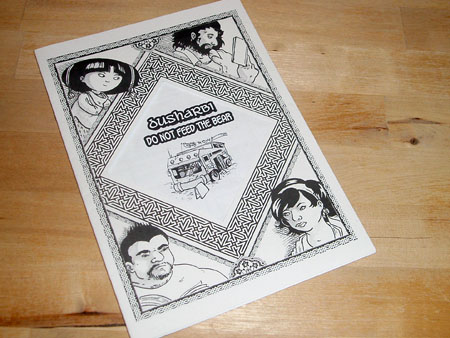
‘Dusharbi: Do Not Feed the Bear’ by Caroline Parkinson, 12 pages, A5 black and white stapled single issue, £3.

Before I start on the review I was just visiting Caroline’s website to check if she had prices listed for her comics and wow this comic is an oldie!  It was drawn in 2005!  By the looks of her sketchblog (linked from her website) she’s still drawing, but I can’t help feeling I’ve somewhat missed the boat on this one, even if I did get a copy provided for review.

In another interesting internet-based development – I’ve just found that the comic is free to read on Willie Hewes’ old short-webcomic-hosting site, aptly named ‘Webcomic Shorts’.  So if you’re curious about it but see no way of getting your hands on this hard-to-find issue, you can still read it! (the wonders of modern technology)

And so before I stumble upon any other stupendous finds, to the review!

In ‘Dusharbi: Do Not Feed the Bear’ a young girl called Li gets sent out shopping in the market, but when the greengrocer’s is shut and she is pointed in the direction of some likely-looking trees on the East side of town, she finds more than she bargained for…

This issue is a standalone side story to the author’s main ‘Dusharbi’ comic project, which revolves around a mobile library that serves villages in an Eastern desert.  ‘Do Not Feed the Bear’ is a neat little one-shot that wraps itself up tidily within the page count.  This comic could therefore be enjoyed on its own without needing to buy any of the rest of the main series.

The best thing about this issue is the way it is presented.  The peephole in the front cover gives a handmade feel, the library stamps on the inside front cover and the advertisement for the travelling library on the back cover point to this being a series with a lot of personality.

However, having seen these elements before reading the one-shot story inside, I was a little disappointed that this issue wasn’t about the library itself.  I think, in the end, picking up issue one of the main Dusharbi comic might be more satisfying than a short side-story – however, this did succeed in getting me interested in the series in general.

The artwork has no glaring problems and I could understand everything that was going on.  Some of the smaller panels may have benefited from having less detail though, in order to help the pace of reading.

It looks like the grey tones that the comic is shaded with were originally laid down with marker pens, which was then converted into screentone-style dots before printing.  This results in some areas of muddy mid-grey tones.  The detailed linework here would probably benefit more from some simple, flat areas of screentone that provide some contrast but allow the linework to speak for itself.

The comic consists of black and white printed pages with a black and white lightweight card cover.  The pages are stapled together.  Printing is clear and easy to read, with no smudging.

‘Dusharbi: Do Not Feed the Bear’ is a neat one-shot side story to an intriguing main saga about a travelling caravan in the desert. The presentation of this comic is quirky and fun, although hearing about the caravan that is only hinted at here might have made for a more satisfying read.

More of Caroline’s work can be found on her website.  This comic is free to read online at Webcomic Shorts.

A review copy of this comic was provided.

‘Between Worlds’ Part 1, by Anna Fitzpatrick

Posted in Review with tags , , , , on January 14, 2010 by comicmole

Between Worlds Part 1 by Anna Fitzpatrick, 56 pages, A5 perfect bound booklet, IndieManga, £4.00, rated teen 13+

First-off, this review focuses on the black and white print version of Part 1 of Between Worlds (as detailed above), but there are other ways to read this comic too.   There is a full-colour, larger format, special limited edition printing of Part 1 available from IndieManga for £15.00, or if you can’t wait to glue your eyeballs to both this Part and the beginning of Part 2 then check out the full colour webcomic version of Between Worlds on DrunkDuck (you can also leave comments for the author there on a page-by-page basis if you want to).

It is cold on the night of the aging King Bergen’s birthday, and a light snow has started to fall.  A grand speech has been planned, but as the King prepares to give it he is taken ill.  It seems that one of his four Knights, the female soldier known as Lynx, is tormenting him in his dreams.  Lynx herself however is confused.  Is the King simply suffering paranoia brought on by old age, or is something more sinister afoot?

Immediately upon starting this comic I felt pulled into its world.   I could almost see my breath in the chilly air and watch the snow float by.  There was also a creeping sense of melancholy brought about by witnessing the aftermath of the old King’s fall from virile youth to confused old age, and perhaps his nation with him.

Within this nation resides the protagonist, the Knight Lynx.  She is somewhat reminiscent of Oscar from Rose of Versailles:  a female soldier who holds a high rank and seems to be successful, but comes across as an isolated figure who doesn’t completely understand those around her, and whom no-one can become particularly close to.  She is an intriguing character, obviously very capable but perhaps harbouring a hidden weakness or pain.

We don’t get to learn an awful lot about her though as, although Part 1 is long compared to a lot of small press comics, it very much reads like a prelude to the main plot of the series.  The pace of reading is also relatively slow, so over the story’s 36 pages plot events only begin to unfold.  This is not a criticism however, as like many readers I appreciate an author giving their story the time it needs to unfold at a pace that suits it.  Just like the period manga series ‘Emma’ by Kaoru Mori, I can see a lot of readers enjoying the attention to detail and inclusion of quiet moments here.  The only thing that worries me is that the story seems like it could be quite long, so I hope that the creator keeps producing material and that ‘real life’ doesn’t get in the way, like it can do with longer side projects.   Here’s a reason why, so we can see more artwork like this:

This page is from the webcomic version, but in case anyone is worried that the painted pages might turn out muddy in black and white they actually hold up very well.  I can’t get a good scan of my copy of the comic without ruining the binding, but I’ve mocked up a quick example of colour vs. black and white with some astounding Photoshop wizardry:

As you can see, the tones on the page are well balanced for retaining their impact in black and white, and the book is balanced nicely like this throughout.

After those examples I’m not sure if there’s anything else I really need to say about the artwork.  As you can see the comic is digitally painted in full colour for the webcomic and special edition versions, and desaturated to greyscale for the black and white edition.  The painting style has an organic feel, with important elements being picked out in either very dark or very light linework where appropriate to the background colour.  Highlights such as snowflakes or points of light add an ethereal and fantastical feel to the world.  Some pages of the comic seem like they had more care taken over them than others however, with some devolving into a sketchiness that is perhaps a little too uncontrolled to hold up to the rest of the book.

On the right above is the A5 black and white edition of Between Worlds Part 1, next to the larger special edition version.  Both books are very well presented.  The black and white version has full colour covers and is trimmed and perfect bound into a neat booklet, rather than stapled.  All of the text in the comic is clear and easy to read, tho perhaps a little large in the special edition version.  Digitally produced text bubbles stand out rather a lot from the more natural feel of the painted pages behind them, but personally I would rather be able to read a comic clearly than be bogged down by less readable hand-written text.  Colouring the text bubbles slightly in the colour versions of the comic is a nice touch that helps to integrate them with the look of the page behind.  Perhaps hand-drawing the speech bubbles themselves though might have helped to link them to the page a bit more successfully.

As well as 36 pages of story, both the normal and special edition books of Part 1 include several pages of interesting extras.  All in all the books each have 56 pages, of which 12 are extras.   These include many concept sketches and a two-page mini comic called ‘Juno’s First Day’.

Between Worlds Part 1 is the beginning of a story with a lot of promise.  A feeling of melancholy and uncertainty in the nation of the old King Bergen is reflected in the introduction of the isolated protagonist, the Knight Lynx.  And apart from a few rather rushed looking pages, the organic, otherworldy style of illustration makes this a comic to seek out and enjoy.

The best way to immediately read some Between Worlds is by visiting the webcomic.  And to see more of Anna’s artwork, why not visit her website, or art blog?

A review copy of this comic was provided by the publisher.

A New Year, A New Schedule!

Posted in Other on January 6, 2010 by comicmole

Happy new year all!  My new year’s goal for Comic Mole is, rather than having a flurry of updates and then nothing for a month or two, to pace myself to one update every two weeks and try and keep to a steady schedule.

Its unfortunate that I probably can’t manage anything more frequent than a bi-weekly update schedule, but such is life I guess.  I know I’d rather read a blog with a slow but steady stream of updates to one that randomly dumped loads of stuff on me then went dead for weeks at a time!

Actually, it has been suggested that perhaps I could cast about for folks who might like to do a guest review or two.  If anyone likes that idea then please get in touch!  You would need to be able to write about as well as me (e.g. you don’t need a degree in English or anything, but people should hopefully be able to understand what you’re on about ^_~ ).  If anyone were to jump on this idea then their work would be added in between my bi-weekly updates, thus taking us to the dizzying heights of weekly updates every now and then! (if anyone would like to re-visit anything I have already talked about, that’s fine, multiple opinions on things are always welcome)

My first review of the year should be this weekend, once I’ve had a chance to type up my horrendously old fashioned analogue notes into magical digital form.

And with that, I shall bid you farewell until the weekend ^_^

‘Much Ado about Nothing’ from Manga Shakespeare: a guest article by Kate Holden

Posted in Guest Article with tags , , , , , , on October 26, 2009 by comicmole

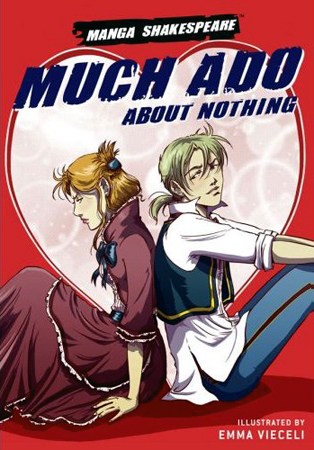
William Shakespeare, adapted by Richard Appignanesi & illustrated by Emma Vieceli, 208 pages, A5 softback book, Self Made Hero, £6.99.  Available in high street bookstores or online stores such as Amazon.

After a break from our mini ‘Emma Season’ on Comic Mole in order to announce some new releases for the London Expo, we’re back to round it up with another fun and informative guest article from Kate Holden!  This time she takes a look at SelfMadeHero’s Manga Shakespeare version of ‘Much Ado About Nothing’, once again from the point of view of a reader with a degree in English Literature.

Mole note: spolier alert for Much Ado!  This article is best read if you already know the basic story and characters of Much Ado About Nothing, either having read it, seen it on the stage or as a film etc.

Once again, I’ll hand you over to Kate now…

muchAdoCover

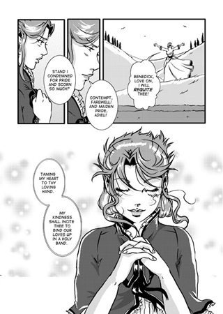
If ever there was a Shakespeare play to be adapted into comic form that would sound like a daunting prospect to me, Much Ado is it.  It’s not high concept.  It doesn’t have a big, obvious hook.  No ghosts, no cross dressing, no magic, no fights, no deaths.  Not like Romeo and Juliet, which can be excitingly summed up as, ‘two star-crossed lovers take their life!’.  No, this is something different.  ‘Much Ado About Nothing’ is a deft and subtle play, jam-packed with wit.  In many ways it feels like a precursor to the ‘Comedy of Manners’ genre of plays from the later Restoration period.

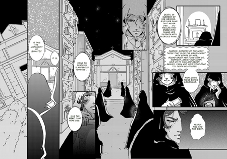
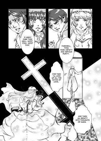
As the title suggests, in this play there’s an awful lot going on over not much of importance.  The title itself is an understatement, since there’s a life at risk among other things, but that understatement is what makes it such a fitting title, as this is an understated work that really plays with language and meaning.  To make it successful as a comic requires a lightness of touch.  While this publication has the same illustrator as Hamlet – it’s Emma Vieceli again, albeit with a few years’ more experience giving a more polished look – the style and setting are quite different.  Much Ado employs finer inking and more diffuse tones, so unlike the heavy and sparse feel of Hamlet, this comic has a more shoujo manga (girls manga) feel and a summery atmosphere.  The setting is meticulously reproduced by Vieceli from real Italian scenery.  This isn’t quite a period adaptation.  Or rather, it is, but a later period from Shakespeare’s time.  The overall feeling of the costumes and setting is quite timeless, which I feel works well.  Much Ado is a rather deft and effortless-feeling play, and the art here matches with an elegant, light and airy classical look.

MuchAdoExample1

The play primarily concerns two very different couples.  First we have Claudio and Hero.  Claudio and Hero are young, likely teenagers.  Claudio has just won a lot of honour by performing bravely in war, ‘doing with the body of a lamb, the feats of a lion’.  Having come home with thoughts of battle put behind him, he notices Hero in a new light and Romance comes to mind.  In this adaptation, Claudio and Hero are depicted as two wide eyed and innocent characters, often flushed or excited.  You could easily compare them to Romeo and Juliet.  The plotline of their romance follows a similar course, but with a comedic happy solution rather than a tragic one (Romeo and Juliet reads like a comedy until about halfway through, but I think that’s something to discuss in a later article).  They fall head-over-heels in love, are torn apart by family circumstances, but fortunately there is a happy solution at the end involving trickery and a dramatic reveal!

MuchAdoHeroClaudio

The other couple, and the real stars of the show in this adaptation (they’re on the front cover!) are Benedick and Beatrice.  These two are older and more jaded.  They courted in the past, but fell out and have spent their time since incessantly battling wits.  In this adaptation they look probably around their late twenties to early thirties.  While not particularly old, they contrast the wide-eyed idealism of Claudio and Hero.  Benedick is a lovable rogue in his dishevelled outfit with a slight Han Solo air about it.  He is portrayed as flippant and cheeky, but still quite chivalrous.  Beatrice is an elegant and confident lady, shown by her more elaborate and mature clothes, hairstyle and manner compared to the girlish Hero.  Her personality is calm and cool, kind, but with a barbed tongue, particularly where Benedick is concerned!

MuchAdoBeatrice

Of particular note in this play is the scheming villain, Don John.  He’s a strange character because he doesn’t really have a good reason to want to mess with everybody.  He’s a dark character, portrayed here with black hair and clothes and a solemn demeanour.  His status as a bastard child, unlike his brother, and his less gregarious personality seems to have given him an inferiority complex.  He enjoys causing strife because he doesn’t enjoy socialising.  Notice how he and the Prince are quite similar looking, separated mostly by the colour and style of their hair.  Don John is like a shadow of John Pedro.  Both characters intentionally manipulate those around them, but the Prince does so to make a match, while his brother does so to break one apart.  Don John has the urge to disrupt a society he feels doesn’t welcome him, but rather than admitting his feeling of powerlessness and abandonment, chooses to say that his motivation is just plain villainy.

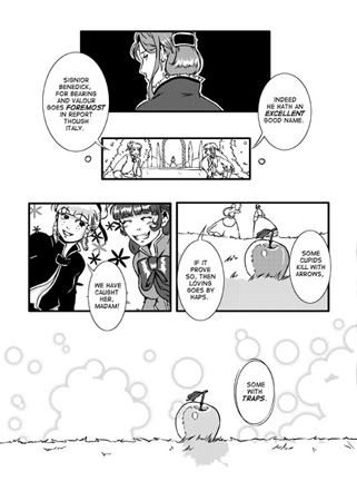
Manipulation is a recurring theme throughout the play.  In this adaptation, notice how the theme is represented through puppets.  Don John is seen with a puppet of Don Pedro, and later we see Don Pedro with puppets of Benedick and Beatrice.  Masks and music also recur as themes, though this isn’t just in the manga adaptation, but part of the play.  Performance is frequently employed, and for most of the play no single character seems to be aware of what everybody else is up to.  Every character seems to be, for good or bad reasons, involved in some kind of secret plot manipulating somebody else!  A visual theme used here is the apple.  My interpretation of the apple is that it is the symbol of ‘cupid’s trap’.  It symbolises romantic temptation, and the clever plot used on Benedick and Beatrice.  Rather than forcing them together, they are lured to each other in order to realise feelings that were there all along.

MuchAdoApple

Much Ado About Nothing is an enjoyable read.  It’s a subtle and complex romantic comedy, and while it may not have the conceptual punch or high drama of some of the other plays, particularly tragedies, if you’re willing to look closely it is a real masterwork, very intricate and yet tightly plotted.  While it may seem light and fluffy on the surface, it has hidden depth and complexity.  The art matches well.  While it’s not so conceptually or thematically bold as ‘Hamlet’ you may well find pleasure in its clever, understated and polished execution.  Like the play, it may look effortless, but there’s a whole lot of thought and detail there and a huge amount of hard work!

Once again thanks go out to Kate Holden for giving her time to write this article for us here on the Mole!  Kate is a member of the UK manga circle IndieManga and currently has work featured in their latest anthology release ‘Legends‘, as well as her own webcomic ‘Fan Dan Go‘, which updates twice a week.

New Comic: Between Worlds

Posted in New Comic with tags , , , , , on October 21, 2009 by comicmole

betweenWorldsCover

Tis the season of new comics (October Expo season that is), and this year the IndieManga table will be the home of this delicious-looking new edition of ‘Between Worlds’ by Anna Fitzpatrick, alongside IndieManga’s new anthology ‘Legends’, which also features more work by Anna.

Between Worlds first debuted last year as a full-colour limited-edition run.  This new volume is a black and white version of the atmospheric hand-painted comic, friendlier to the more price-conscious among us at £4.

However, if you can afford the £15 price tag, I still recommend asking Anna if she has any copies of the limited edition left for sale, as the artwork really sings in full colour (as you can probably tell by the cover image above).

To see more of her work, check out Anna’s art blog Between Two Worlds.